Thursday, October 27, 2011

Happy Birthday Oppa!


Although we're far apart, I'm always thinking of you and thanking you for all that you do. Hands down, you've got to be the best son, friend, brother, grandson, person that we all know. You make us proud and we love your huge heart.

I love you.

Monday, October 17, 2011

Feel Good Books

Why is it that my favourite feel good books come from when I was a child? You may think that it was because it was a time where things were "simpler", but even now they have a quality that can make me laugh until my cheeks hurt and cry with all the feeling in my heart. I think a large piece of me wanted to jump into the story and live in each period. I wanted to be friends with the characters, enjoy their company, console and be consoled by them.

Which books are they you ask? Here they are in a list of no particular order. I wonder what other books from your childhood make you feel the same.


1. The Good Master (Kate Seredy)

2. Little Lord Fauntleroy (Frances Hodgson Burnett)

3. Where the Red Fern Grows (Wilson Rawls)

4. The Wolfling (Sterling North)

5. Number the Stars (Lois Lowry)

Sunday, October 16, 2011

Laurel Denise's 2011 vs 2012 Planner


Laurel Denise makes a beautiful and practical planner. I bought the 2011 planner and as long as she continues to make planners, it'll be the only one I buy and recommend to others.

I just received my 2012 planner today and I thought it would be fun to do a comparison. These are just my opinions and I'm sure not everyone will agree.

  • Covers (Inside and Out)

2011- I can't remember (nor find) the description for the cover of this planner. I believe it was a "kraft" paper cover. Don't quote me! It kind of reminded me of "brown paper packages tied up with strings" (Sound of Music). I loved the plain brown cover, though I had issue with the corners because they started to bend slightly with age (and being tossed into my purse all the time). The logo was on the bottom right, which I enjoyed. The inside pocket was high which I liked. It tucked things in very well.


2012- I personally think that the cover is sturdier than the 2011. It also feels silkier than the 2011 cover and I feel like if I spill something on it I could just wipe it off (not sure if this is true, just saying). The logo is centred and you have the choice of I believe 5 colours (pink, blue, green, grey, yell0w) for the cover. The inside pocket is lower and has a lovely striped pattern on it! That being said, I don't mind that the pocket is lower.

  • Front Page
2011- Though plain, I thoroughly enjoyed it. It had a place to write your name and contact details on the bottom right (if you were ever to lose it...the horror!). I think the space was nice if you are a doodler and wanted to "make it your own" or just to add stickers or decorate or perhaps tape a photo to it.


2012- The logo sits on it as well as a space to write your goals for each month of the year. I think it's clever and allows you to see how you've grown and changed and aspired. It still has space for your name and contact details.


  • Calendar/Weekly View
2011/2012 - I love how this planner allows you to view the month and week at the same time as your notes for what you want to do this day and week. It's small, but I believe it gives you enough space to write what you want to.


Unfortunately, I do have one small issue with the weekly view. The calendar does not necessarily stop at that month. For example, Jan 2012 ends on the 31st. With the last week starting on the 30th. The 30th and 31st aren't in the Jan 2012 section, but are carried over to the Feb 2012 section. I'd prefer all of Jan to be in that section, with perhaps extra space to doodle or something. But once again, that is just my opinion.


I'd also like tabs put on each week, but I it's an easy fix (I use a clear post it tab to keep track of which week I'm on).


  • Tabs for each month


2011- The tabs were bigger and square. I actually prefer the size of these tabs because they're slightly easier to grip, as well as see each month. They are not stamped on the back, as you can see.


2012- These tabs are shorter and round. I would prefer them to be taller. I like how they are rounded though. I DO like how the month is stamped on both sides of the tabs.


Overall, I'm a fan of these planners. They are cleverly thought out and executed. My hat is off to you, Laurel Denise!


Please forgive the photos. I am by no means a photographer. I hope I was able to illustrate the differences!

Saturday, October 15, 2011

Hit and Miss


So after seeing so many bloggers refurbish, redo, reincarnate old pieces I really wanted to try it for myself. I bought a print on etsy (from Renee Treml) and have really had trouble finding a suitable frame for it. It's 9"x9" and I don't know about you, but it's hard finding square picture frames that don't cost a fortune. I've been scouting out various St Vinnies and the like for a large, cheap square frame. I found one for $6! It is wood of some description and it had some kind of cross stitch in it. I just ripped the cross stitch out and changed the border (matte) part of it. I should have taken a before photo. I went and bought a piece of blue poster board ($1 at the newsagent) and replaced the old tan matte border. I used my ceramic stove top scraper to cut out the centre cut out for the print. I didn't have an exacto knife so I was being "crafty".

Miss # 1: The glass on the frame is a bit frosted.
Despite trying to clean it the best I could it still is a bit "cloudy".

Miss #2: A few straggly strands that are visible on the bottom part of the border.
I had to go over one part of the border with my "exacto" knife and so it left some straggly strands

Hit #1: The frame was a perfect size and price! All together this cost $7. Yay!

Hit #2: The redo didn't take that long (Maybe 30 min)

Hit #3: It looks great in the living room!!!

Hit #4: When I upgrade the print to a better frame I have another idea for this frame


Tuesday, October 4, 2011

Decor

I'm not exactly sure what my sense of style is. I tend to fancy anything that is well thought out and effortless in execution. I'm always browsing blogs and online shops and get so much inspiration. In the future, when I am able to sew I know I'll have a million projects to start (and hopefully finish). As I am currently residing in Australia I am falling in love with certain pieces from Australian artists. I have no idea whether they all fit in well together, but I can't help but to want them all under one roof.

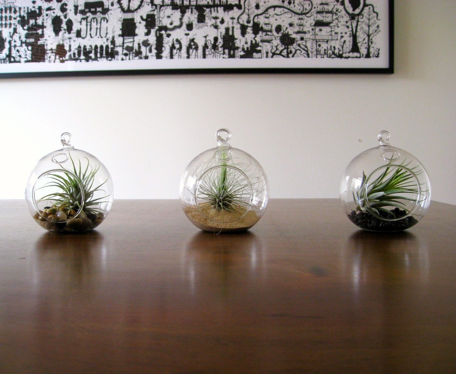
1. Terradctl on Etsy.com

I'm not sure whether I would like them hanging or on a table. I think they'd be lovely for a wedding as well.

2. Ethicurean

These bags are really simple and beautiful. I own 4 of the Cotton French Gauze Produce Bags and they are very sturdy. I would like to purchase the Cotton Produce Bags as well.


3. Foxes of Fancy (Tex & Joe)

I found Foxes of Fancy through Renee Treml's website. This wall organizer is lovely! I enjoy the eggplant-like colour and it's simplicity. I think I would put letters and postcards and other bits and pieces in the folds. Maybe even some take out menus.


4. Renee Treml

It's funny how I even discovered that Renee Treml existed. I did a "wombat" search on etsy.com. I fell in love with her tired wombats with beautiful native (Australian) birds. I believe Renee is American (like me)! She also makes cards, brooches, and ornaments. I would LOVE to buy her cards and more prints. I actually own the print of the image below. I am trying to find a suitable (affordable) frame for it. I've found that it is difficult to find square frames! Why is that?


5. Sharon Muir
She has such lovely ceramics. I am in love with all the bird pots. I particularly love the ones with painted wings. I am not sure what (if anything) I'd put inside them, but they are stunning. There are birds with all different designs.


Although there are more pieces that I would love to have, I believe this is the end of my post today.